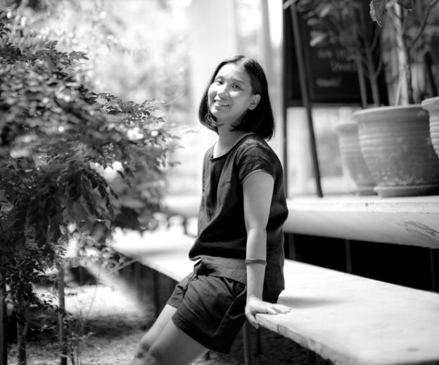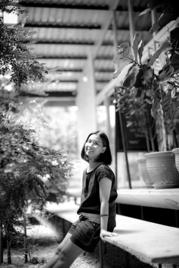
Amy Liang has done several projects since establishing her own architecture and design firm, Cocokacang (@cocokacang). But many might only recognise her newer works, which include APW Bangsar, and within that, the popular brunch spot, Breakfast Thieves — her first time designing a café.
“I don’t really follow the local designing trends and I’m not actually a café hopper,” Liang confessed. With a penchant for merging the location history with her architectural design, she successfully created one of Klang Valley’s most attractive cafés to date.
How did Cocokacang come about?
When I left my former job, I wanted to create furniture, place them on consignment before going back to focus on bigger architectural projects again, but things didn’t work out as planned. I was subsequently commissioned to build the space for The Royal Press here in Bangsar – and that kick-started Cocokacang.
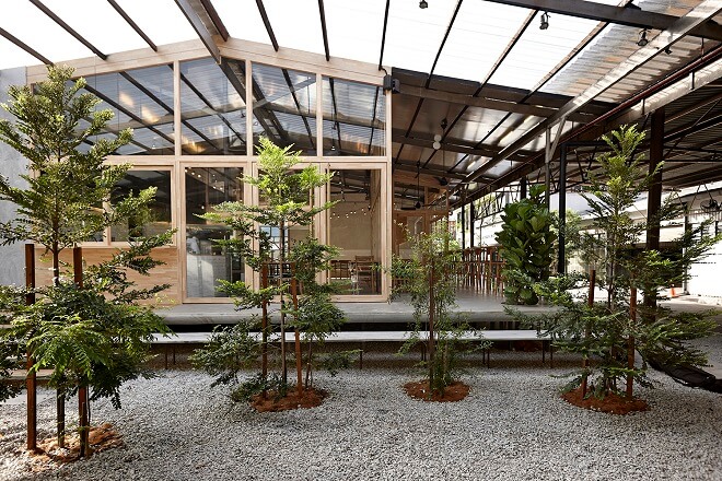
We converted this space, which was previously a warehouse, to an F&B belt, which is what you see today. It was then divided into several different sizes such as S, M, and L. Breakfast Thieves would be a size M, and after much consideration, the management at APW divided the rest into four S-sized outlets, which currently consist of Agak-Agak, Proof, Kaiju, and (the now defunct) Case Study. We also placed pocket parks that encircle the F&B belt.
Can you explain the design of Breakfast Thieves?
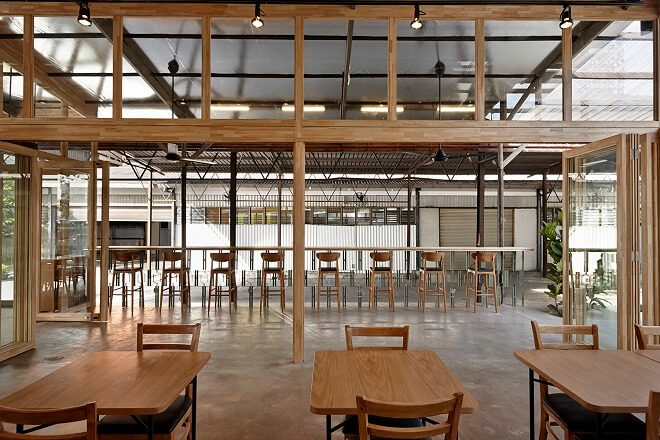
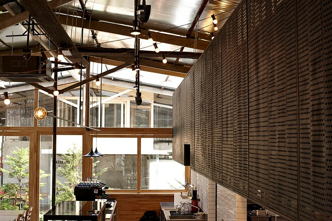
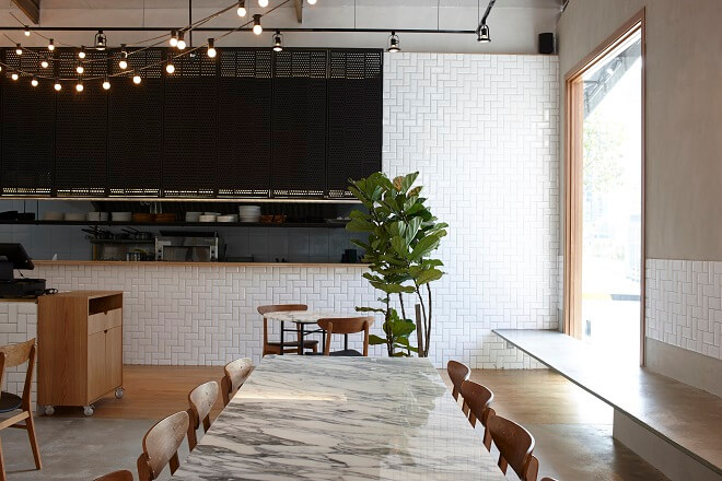
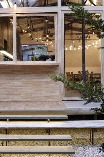
If you noticed, we raised the platform of the café. The idea is that you can walk in, order a coffee, sit in the al fresco area and look out to what’s happening outside. I try to connect some historical elements to the design as well. For example, the wood is rubber wood, and the reason behind that is because this land used to be a rubber estate. We also designed Breakfast Thieves in such a way that it makes the customers to have to walk around to the entrance in order for them to see that there’s actually more to APW than just this café. The big window beside the cashier is what I call a “communication window”, which allows them to see the inside of the café before they enter.
What is your opinion on the “Insta-worthy café” trend?
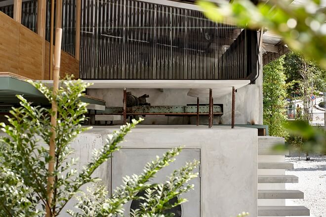
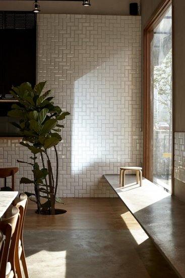
I notice people talking about it a lot in recent years. Actually, I never knew that people loved taking pictures in cafés. I thought the big window by the cashier would be a popular spot, but it turns out that people prefer to take pictures by the staircase outside the tea house! But definitely, being “Instagrammable” is a factor in design nowadays. I have clients who would specifically request a corner or space that would look good for social media.
Is this a good or a bad trend?
Ever since I started taking on more F&B projects, I found myself visiting cafés and restaurants that I saw on social media. Some turned out to be nice and interesting, and some were disappointing when I felt much design improvements could be done. This is why I often advise my clients to not just focus solely on one spot – but of course, that also depends on their budgets.
